Homepage
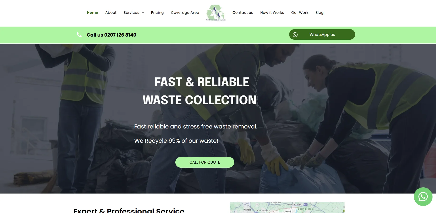
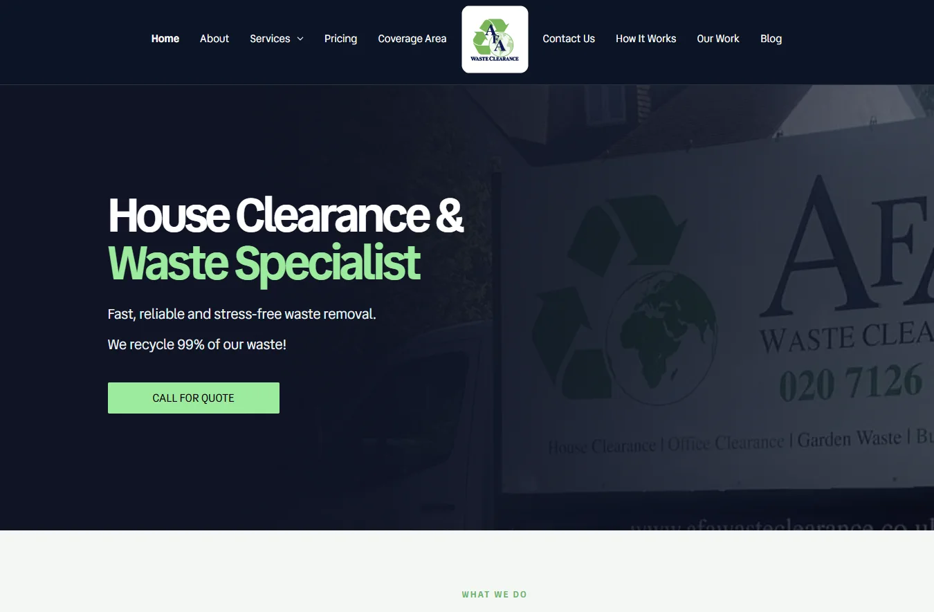
A stronger visual hierarchy gives house clearance greater prominence, makes the enquiry action easier to find and uses AFA’s own van photography to connect the website to the business.

Paid website redesign
03 / 08
A new customer-facing website, delivered within the CMS a family-run business already knew.
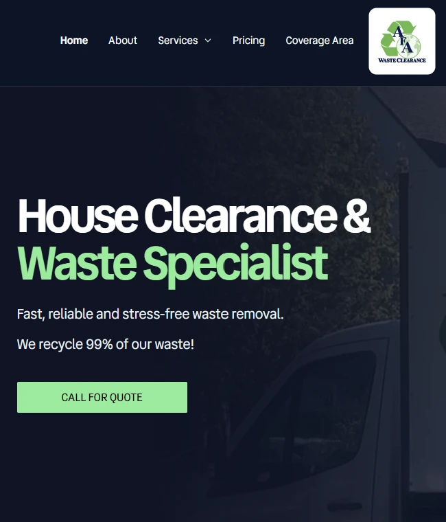
The redesign demo uses non-sending enquiry forms.
Built for the business
Lucianic delivered the redesign within AFA’s existing platform, adapting the design to its capabilities while preserving the team’s familiar content-management workflow.
The result is a more consistent customer-facing experience with a navy-and-green identity, clearer service emphasis and more visible enquiry actions.
At a glance
The challenge
Customers needed a quicker way to understand AFA’s house-clearance service, check whether their area was covered and find the right route to request a quote.
AFA Waste Clearance wanted a more contemporary website while keeping confidence in the system used to manage its content. Lucianic redesigned the customer experience within that familiar CMS, strengthening the visual hierarchy, service presentation and route to enquiry.
The requirement
AFA Waste Clearance is a family-run business. Its team wanted the website to feel more current and professional, but it also valued the confidence that came from managing content in a familiar CMS.
Introducing a replacement platform would have meant learning a different editing system. Retaining the existing CMS was therefore a practical project requirement and an important part of continuity for the business.
Lucianic treated that constraint as part of the design brief. The work focused on understanding the business, improving the customer journey and finding the strongest result the existing platform could support.
Before and after
The project screenshots show how the redesign developed the presentation while keeping the underlying content-management approach familiar to AFA.
A stronger visual hierarchy gives house clearance greater prominence, makes the enquiry action easier to find and uses AFA’s own van photography to connect the website to the business.
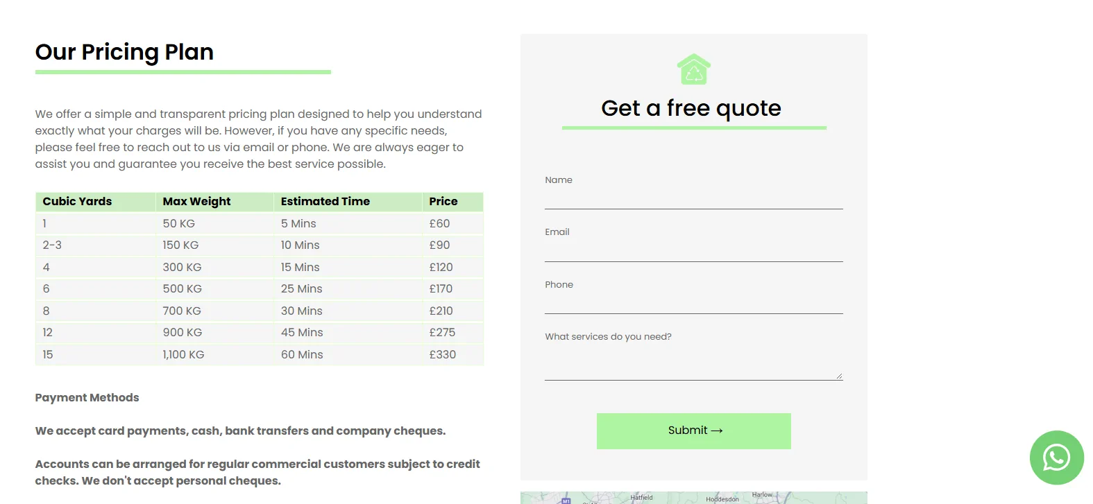
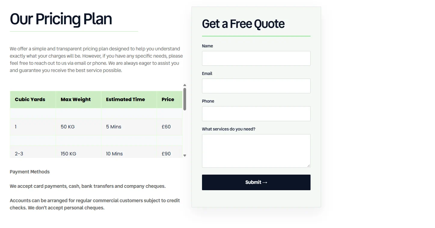
Clearer typography, more distinct form labels and a defined quote panel give the pricing information and enquiry step a more deliberate structure.
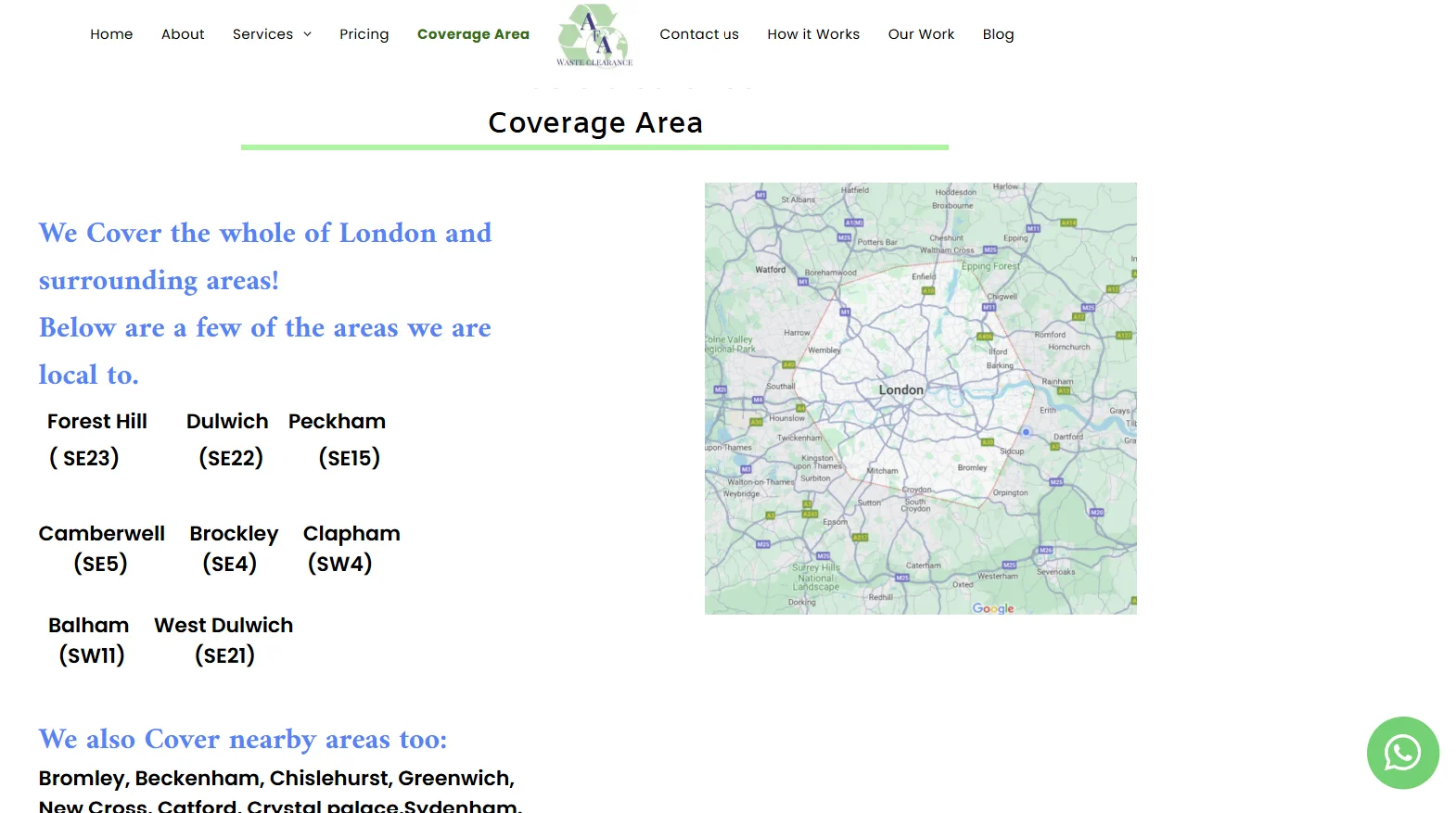
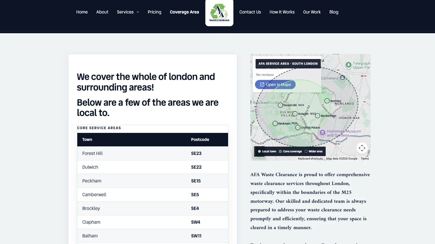
Towns and postcodes are grouped more clearly and presented with more consistent styling, helping visitors scan the areas served.
The redesigned screenshot records an intermediate map treatment rather than the final delivered map.
The result
AFA retained the CMS its team was comfortable using while gaining a more coherent public-facing design. Services, pricing, coverage and enquiry routes now share a clearer visual language.
The project shows that improving a website does not require every system behind it to be replaced. Thoughtful design can respect the way a business already works while giving customers a stronger experience.
Client perspective
“Thanks to Lucianic, our website looks absolutely fantastic! Best of all, they designed it around our existing CMS, making the transition completely seamless.”
Noddy, AFA Waste Clearance
What was delivered
Bring a problem into focus
Share the current workflow, where it creates friction and what needs to work better. Lucianic can help shape a practical next step.